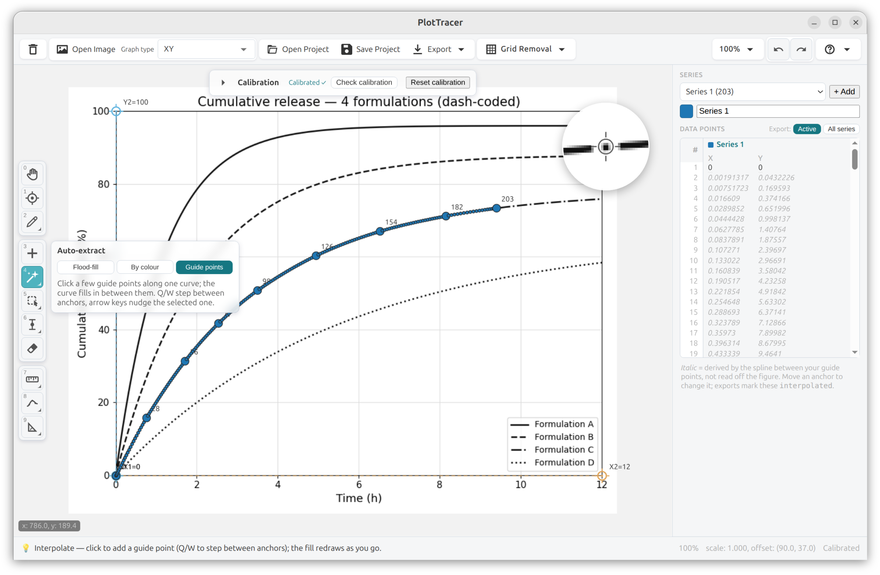
Four dash-coded curves running close together - two traced from a handful of guide points, and you can see the points land on the ink.
Somebody published the chart and kept the numbers. PlotTracer gets them back. A figure in a paper, a chart in a report, a plot in a scanned PDF - open it, mark the axes, and read the values straight off in the figure's own units. It records what the figure shows, and nothing it doesn't.
macOS · Windows · Linux - free, offline, no account
Four dash-coded curves running close together - two traced from a handful of guide points, and you can see the points land on the ink.
Span charts, candlesticks, and stacked bars rebuilt as their own connected type. A legend drawn inside the plot can be painted out. Labels are read off a heatmap's own columns and rows. And a heatmap axis now says what kind it is, which decides where its cell boundaries come from.
Its segments are connected: a segment's base is the top of the one below, so the edge the figure drew once is measured once. The value reported is a height rather than a position on the axis, and moving a boundary carries the stack above it, whether you drag it or type it.
A span is captured by its two ends, because a range is what the figure drew. A candlestick reads which way the period went from the figure's own colours, and says what it read before offering to change it.
A legend drawn inside the plot box wears the series' own ink at the series' own size, so no colour filter and no plot-area rule can tell it from the bars it describes. Drag a box over it and it is painted out with the paper colour measured around it - once, for every mechanism that reads pixels.
The label reader now serves a heatmap's own columns and rows, the same drag and the same review card as any other category chart. A piece of bar ink caught in the label band no longer rides into the name it was read beside.
A named heatmap axis derives its bands from a declared count, so it is asked whether the figure's marks sit between the bands or under them. A measured axis is asked neither: its boundaries are in the ink, its clicks are the extent, and its cells are identified by their coordinates.
All of it runs on your machine. The reader and its English data are bundled in the app, and no part of a figure leaves it to have a label read - which is tested rather than asserted: the test removes the network functions outright and the labels still read.
Every release, newest first - what each one fixed, as plainly as what it added.
Mark the axes with a couple of clicks. PlotTracer learns the figure's coordinate system - linear, log, polar, or dates.
Place points with the zoom loupe, or auto-extract a whole curve by colour, fill, or blob detection. Fix anything in a click.
Send clean numbers to CSV, TSV, JSON, Excel, OpenDocument, LaTeX, MATLAB, Python or R - or straight to the clipboard, at the figure's real precision.
Curves that run together and share a colour, heatmaps read cell by cell, floating bars measured end to end, asymmetric error bars, true histogram bins, box plots, pie and donut charts - the same tool, on the plots you meet in practice.
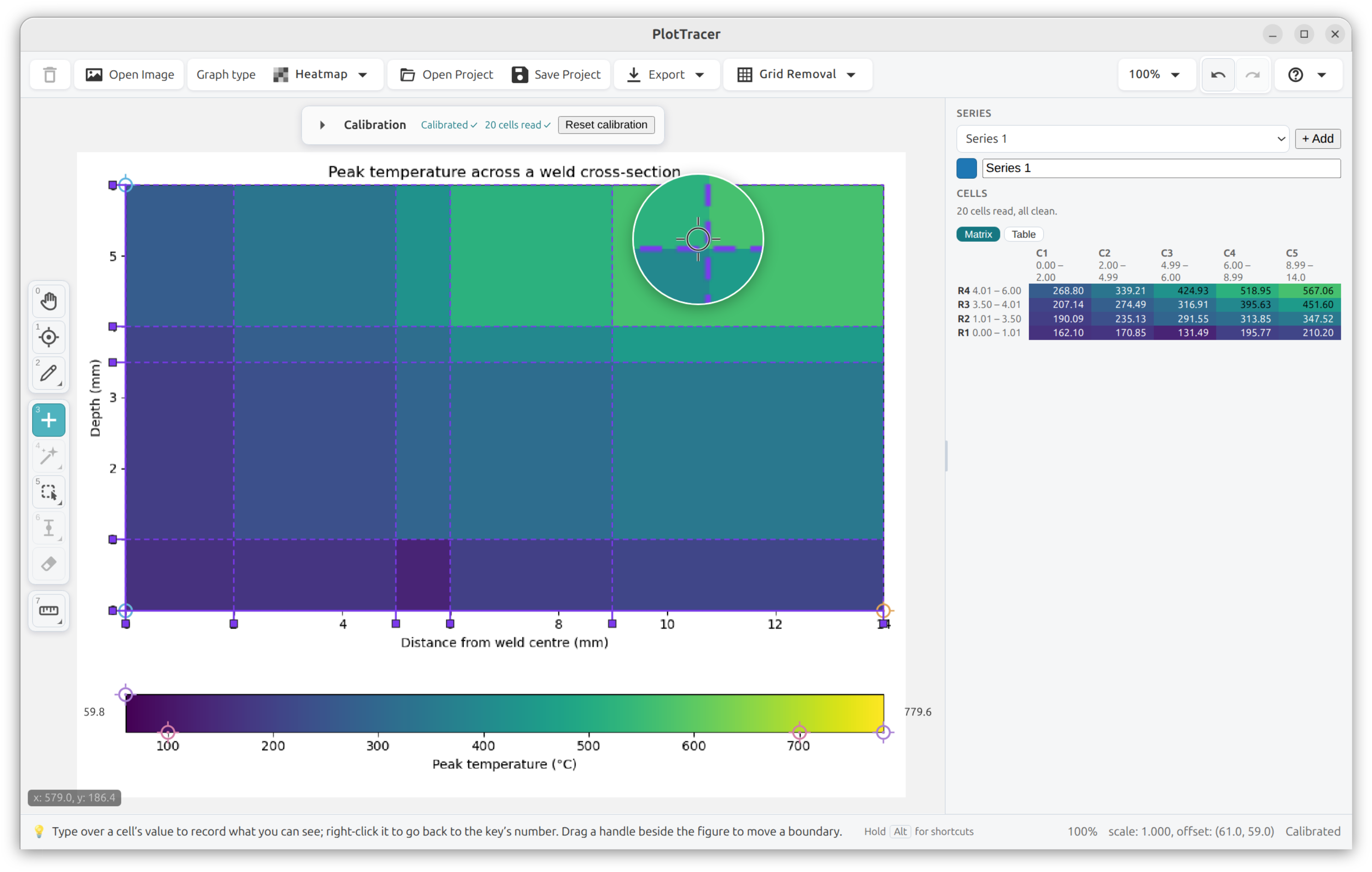
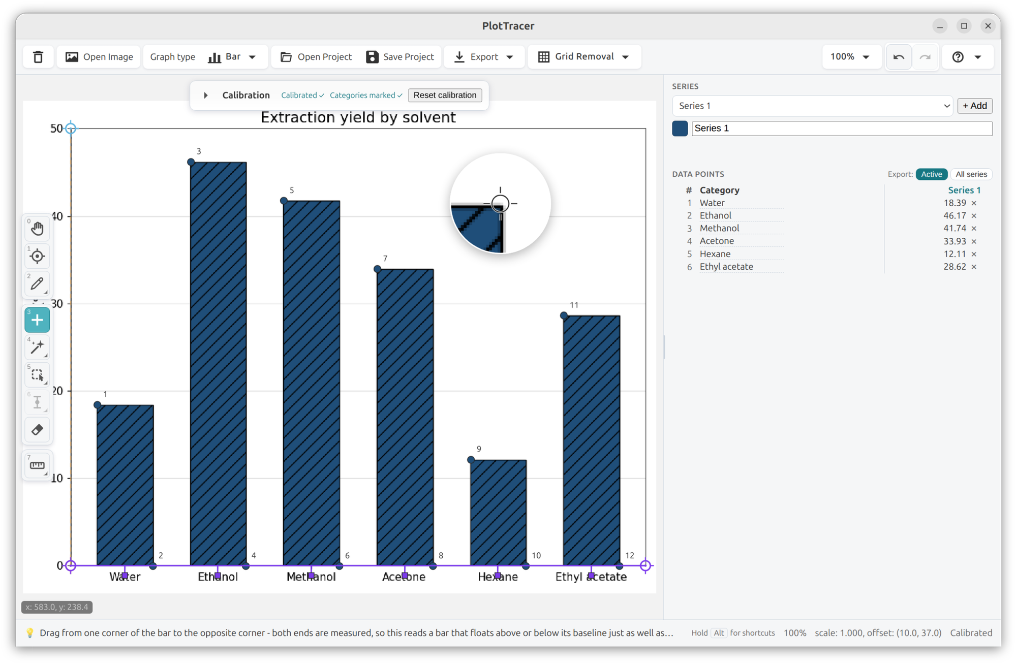
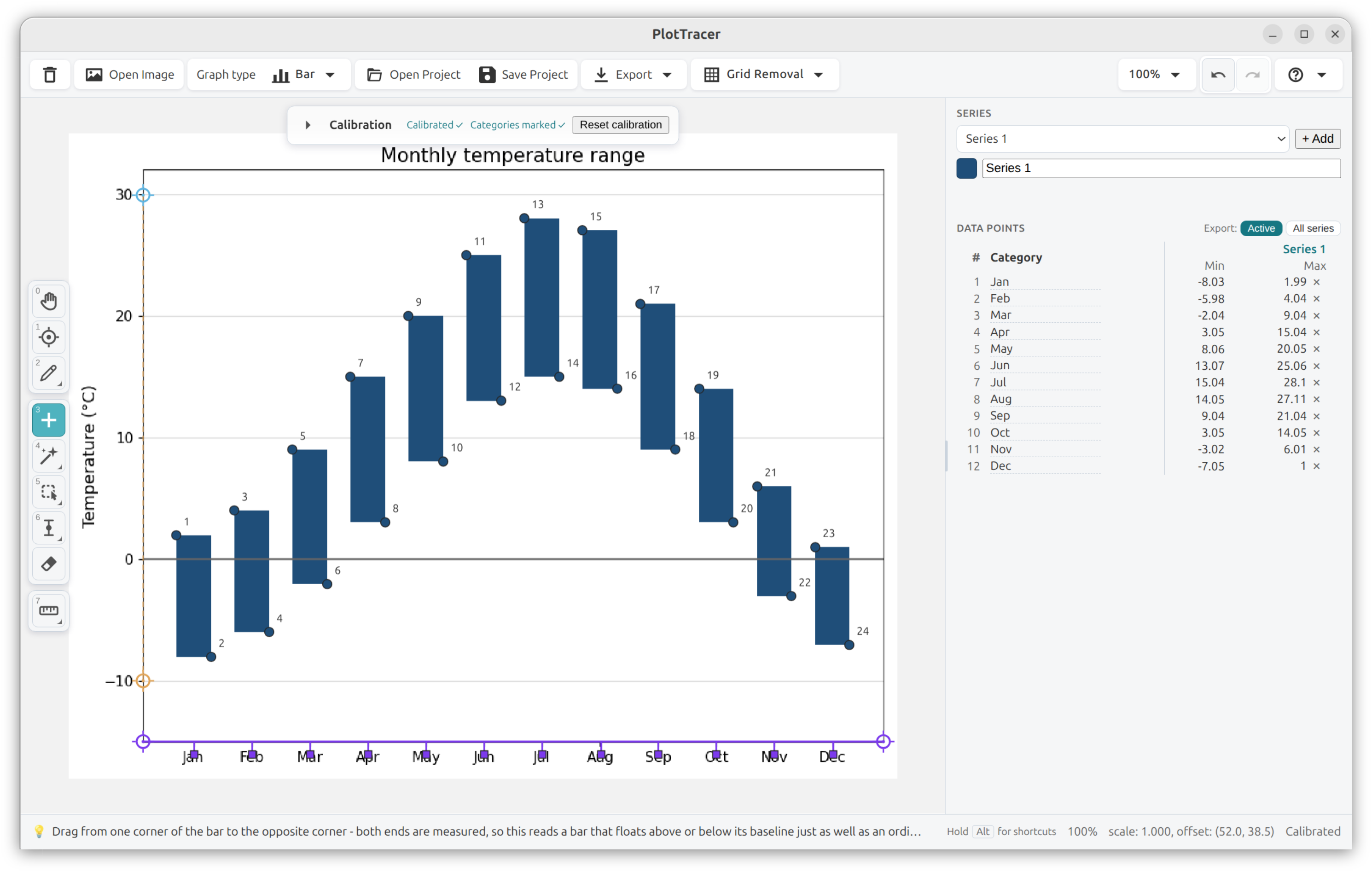
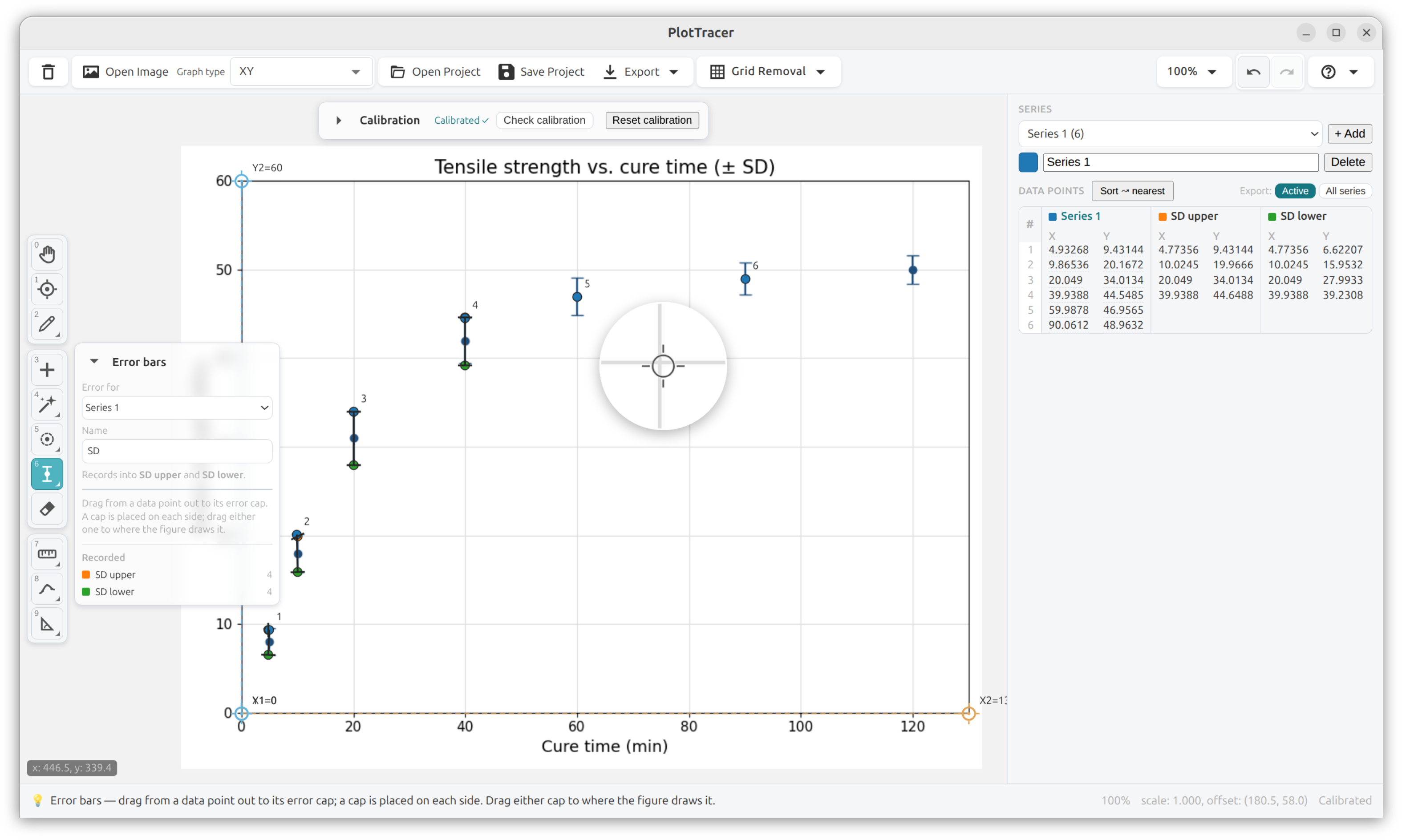
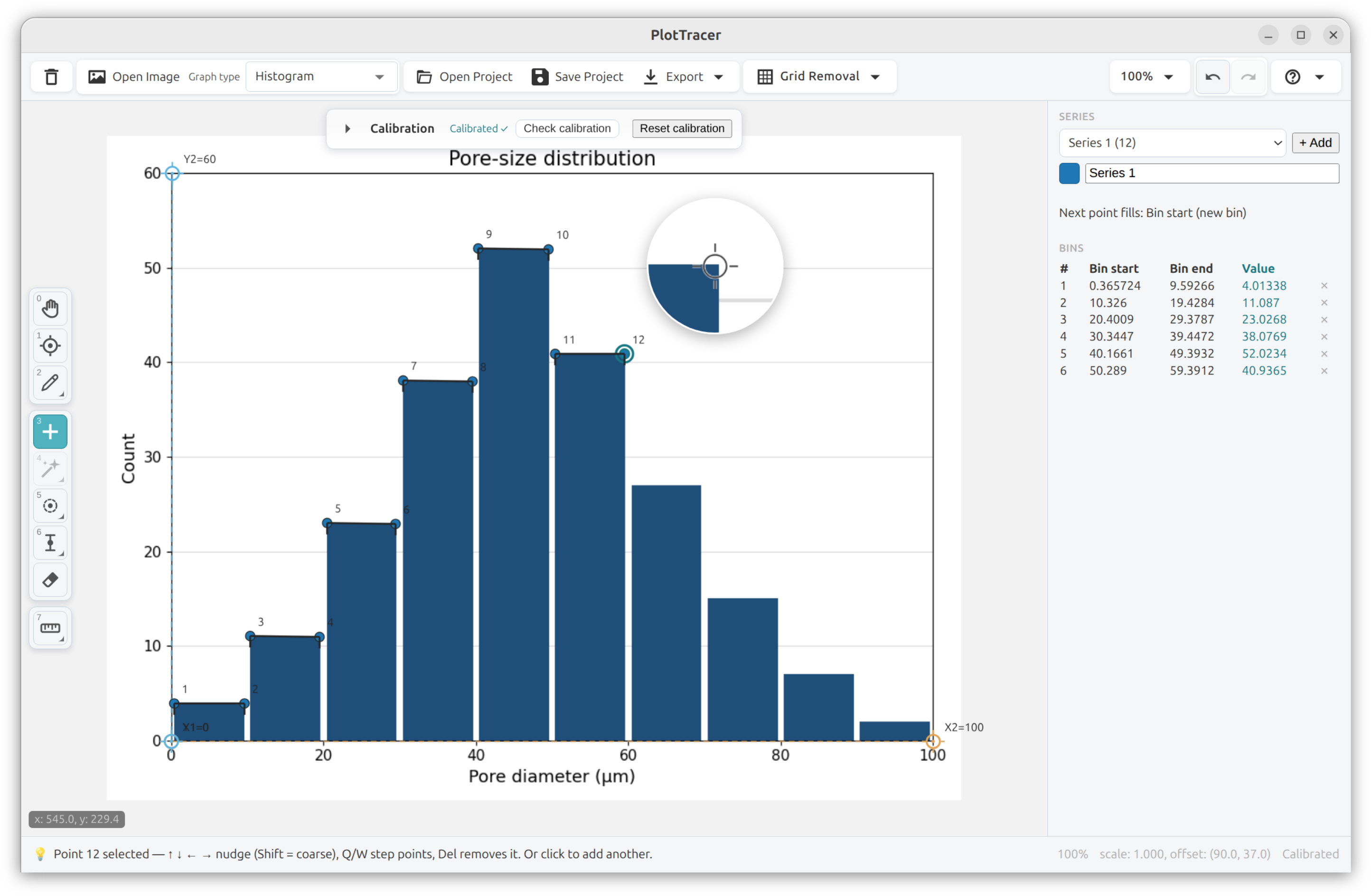
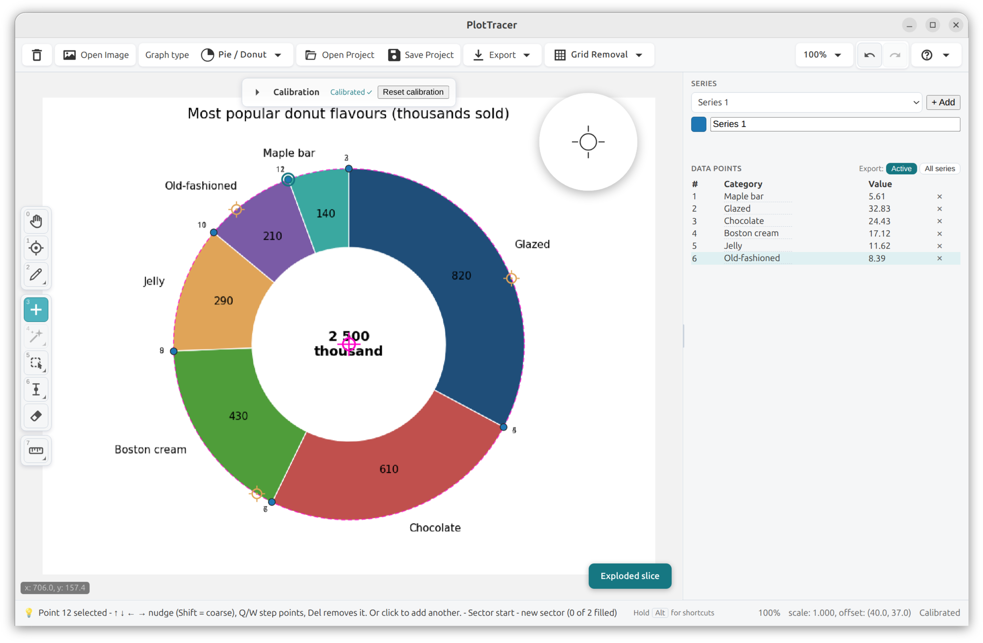
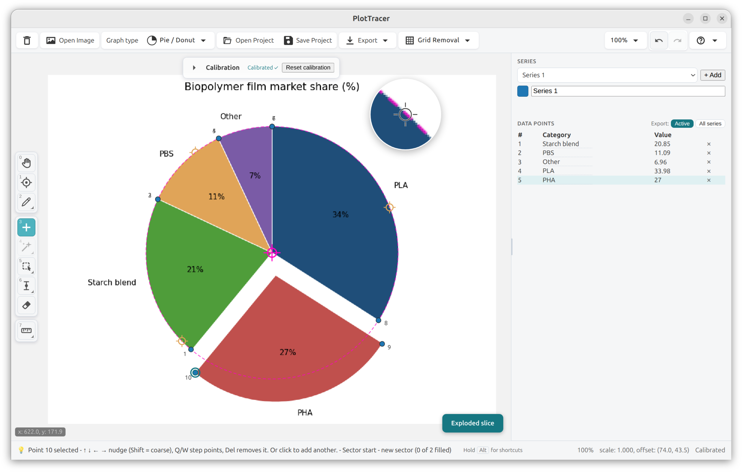
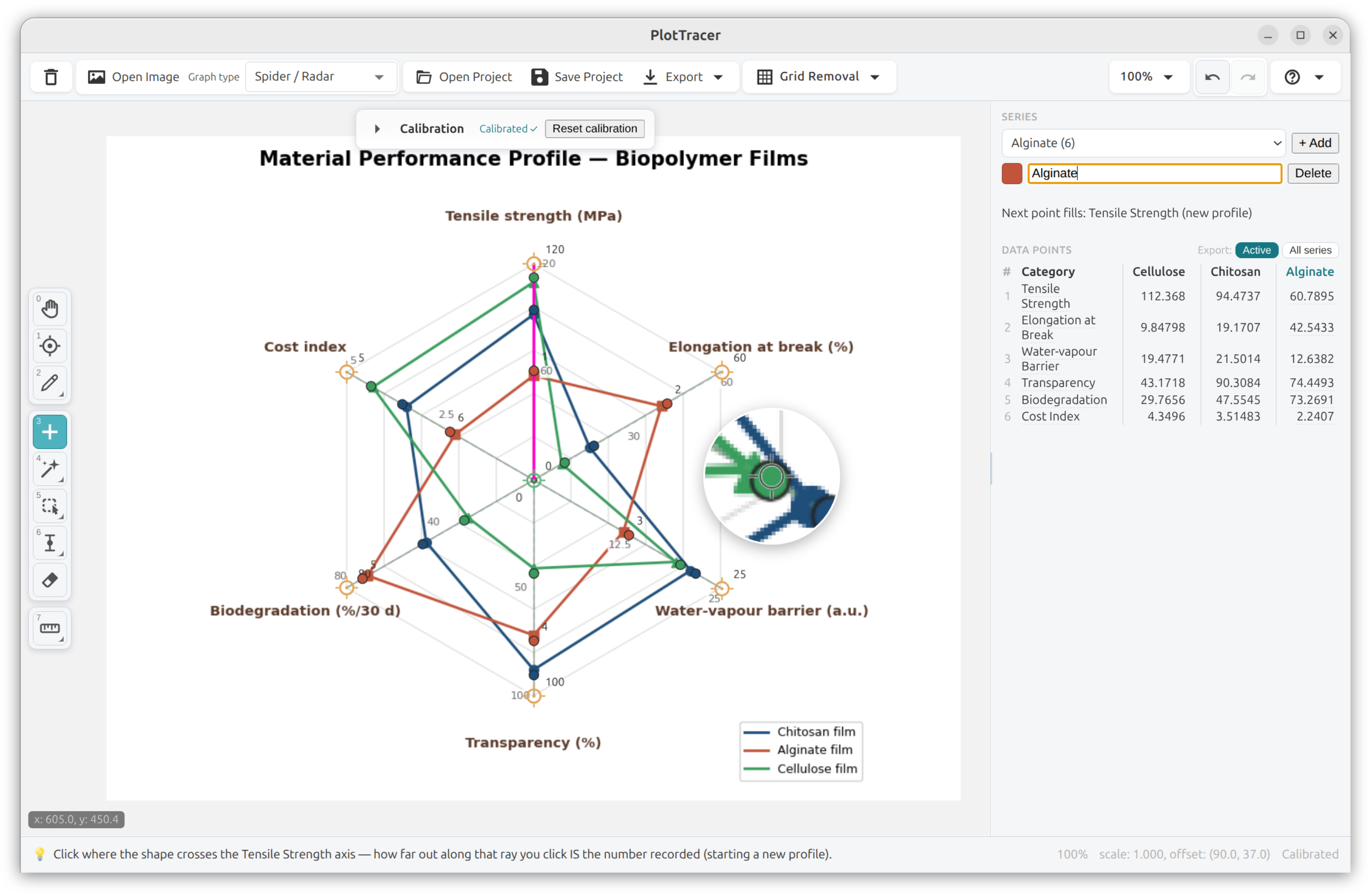
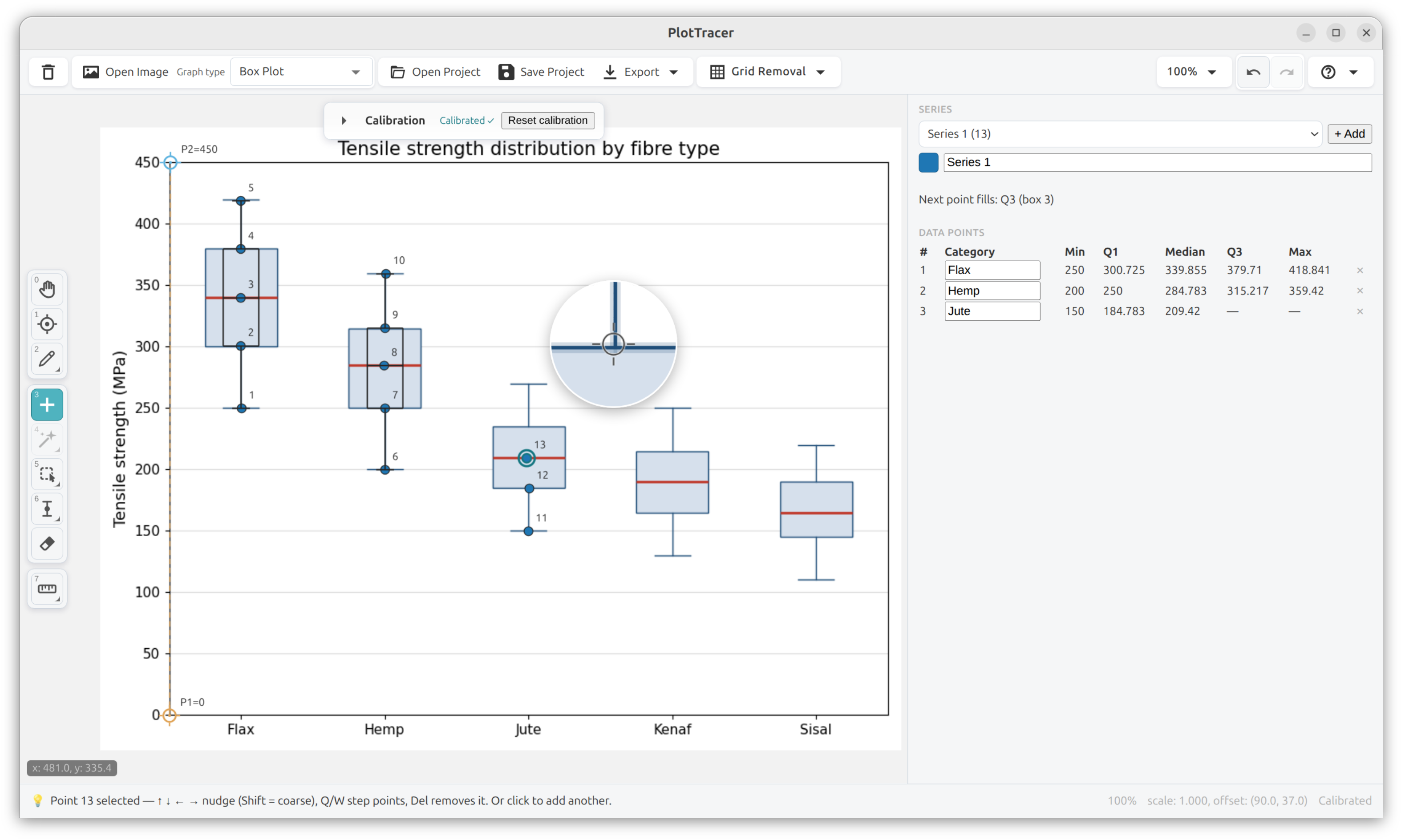
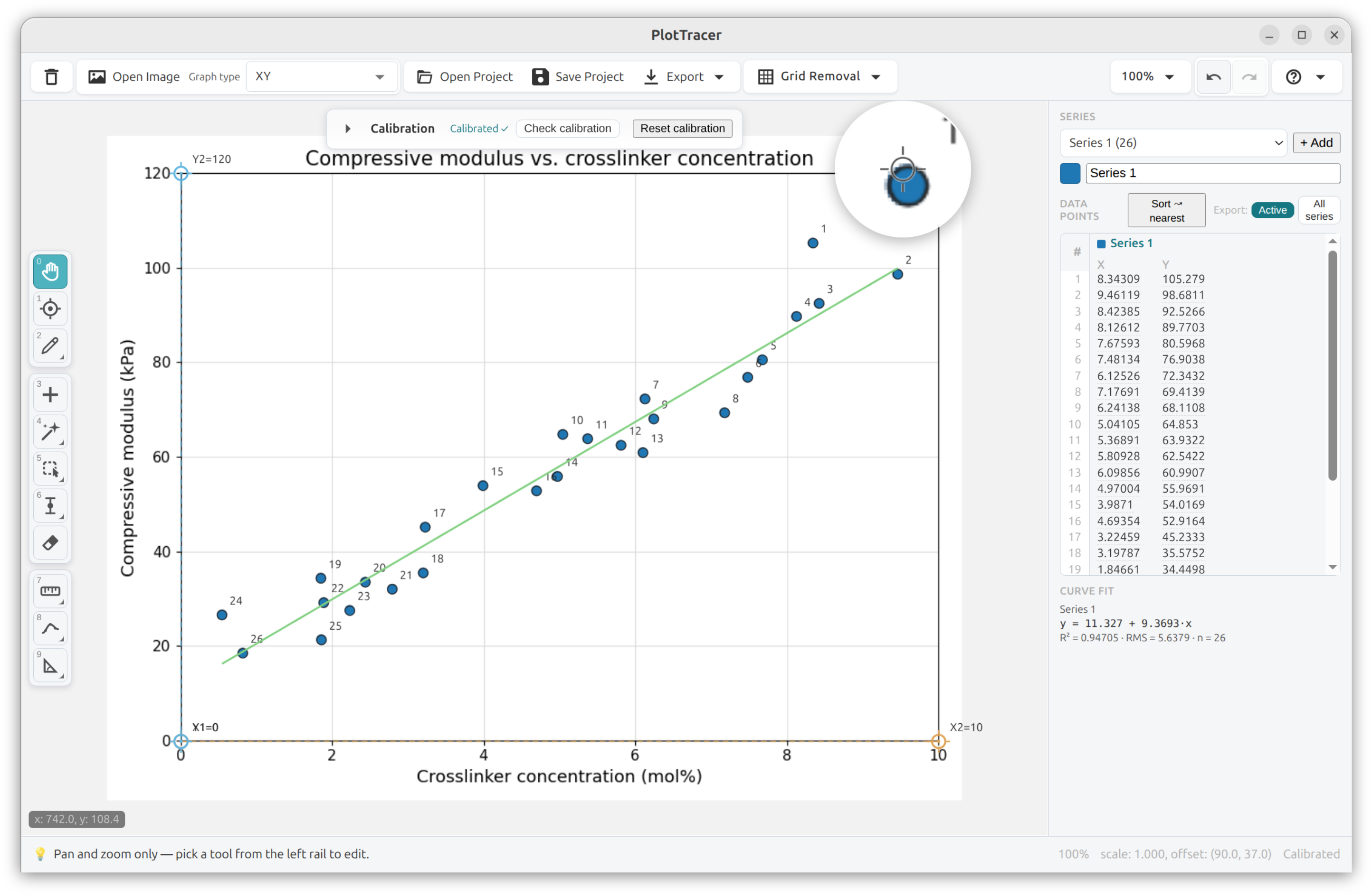
Fifteen graph types over eight axis systems - XY curves, bar charts, histograms, span charts, stacked bars, candlesticks, box plots, categorical lines, pie and donut charts, heatmaps, ternary phase diagrams, polar plots, spider charts, maps, and circular chart recorders. A bar is recorded as an interval, not a point, so a span keeps both ends and a stacked column's segments stay joined at the edge the figure drew once. Histograms capture true bin edges, and every spoke of a spider keeps its own scale. On a heatmap the colour key is calibrated as a third axis, and each of the other two is independently a category or a value - so a genes-by-samples matrix is calibrated by clicking its edges and counting its categories, never by inventing coordinates it does not print. Error bars are not a graph type here: they are captured on top of whichever series they belong to, asymmetric caps and all.
The repeated loop - calibrate, trace, correct, export - is tuned to disappear. Breadth lives in layers you can reach when you need them, never in the way when you don't.
XY, bar, categorical line, histogram, span, stacked bar, candlestick, box plot, polar, spider/radar, pie/donut, heatmap, ternary, map and circular chart recorders - each calibrated the way that figure is actually drawn.
Calibrated from the rim, so the centre is fitted rather than clicked - which is what makes a donut readable at all. A pulled-out wedge is measured about its own tip.
Log (base-10) and date/time scales, chosen per side - exactly what the figure uses.
Trace a whole series in one pass: by colour, by connected fill, or by blob detection for scatter.
Place each cap where the figure actually draws it - asymmetric and all. The tool says up front that the second cap starts as a mirror rather than a measurement, and which series to pick to move it.
A bar's value is its extent, not a point on it: drag corner to corner and both ends are recorded, nothing averaged away. Grouped, stacked and floating alike.
A hatch is drawn in a colour the trace drops, which parts a bar into fragments. PlotTracer puts the pieces back together from their own geometry, so a hatched bar is read as one bar.
Drag one box round the category labels and the names come back read off the figure - each shown beside the pixels it was read from, for you to approve or correct before anything lands. Sideways labels included, and the reader is bundled in the app, so nothing leaves your machine.
Records genuine bin edges and heights - the interval a bar spans, not just its centre.
Interpolation-assist traces dashed, overlapping and monochrome curves that colour tools miss - drop a few guide points, a spline fills the rest, even where a curve doubles back.
Distance, angle, area and slope - in the chart's own units or a scale you set from any length.
Polynomial, exponential, power, logarithmic, Gaussian or logistic, plus arc length, area and curvature. A fit that did not settle says so - on screen and in the file.
One calibration, any number of series - each named and colour-coded - captured side by side and exported together.
Open a paper's PDF or multi-page TIFF and capture several figures into one project.
Crop, rotate, flip, fine-deskew and remove grid lines - before or after you capture the figure.
The project bundles the original source PDF or image and records every crop and page - any number traces straight back to its figure.
One Open Project command reads WebPlotDigitizer, Engauge Digitizer and StarryDigitizer files - recognised by what is inside them, not by their extension. Anything it cannot read faithfully it refuses, and says why.
CSV, TSV, JSON, Excel, OpenDocument, LaTeX, MATLAB, Python and R - or straight to the clipboard, at the figure's real precision. Every export states what the format cannot carry.
Full undo/redo, non-destructive edits, and a project file that round-trips exactly.
macOS, Windows and Linux. No account, no cloud, and your figures never leave your machine.
One click to a spreadsheet, a notebook, or a paper. Every value is rounded to the figure's real resolution - never padded with false precision, never collapsed to zero - with a full-precision switch when you want every digit.
Scored against two public corpora from the CHART-Infographics competition series, with the competition's own metric and someone else's transcriptions: on real published figures, 91.3% of scatter points and 76.4% of bars recovered with no human in the loop at all. Automatic capture, assisted capture and reading a chart's own words are reported apart, never blended together, and the harness and the exact image lists are public so anyone can run it again.
No account, no cloud, no upload of your figures anywhere. Install the desktop app and start extracting.
The User Guide is a 34-page PDF covering every chart type and every workflow in the app - calibration walk by walk, the automatic and manual extraction routes, reading labels off a figure, and what each type records and why. Free to read without installing anything.
Current release: v2.5.0 · AGPL-3.0 · source on GitHub